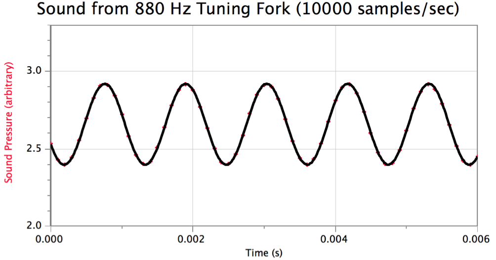
When using the Vernier microphone to measure sound waves, the result is not always a nice-looking sine curve in Logger Pro. For example, the graph of the sound wave produced by a 880 Hz tuning fork when data is collected at 10000 samples/second is shown below. This almost looks like a smooth sine curve, but has some sharp edges at the troughs and peaks. Is it possible to get better results?
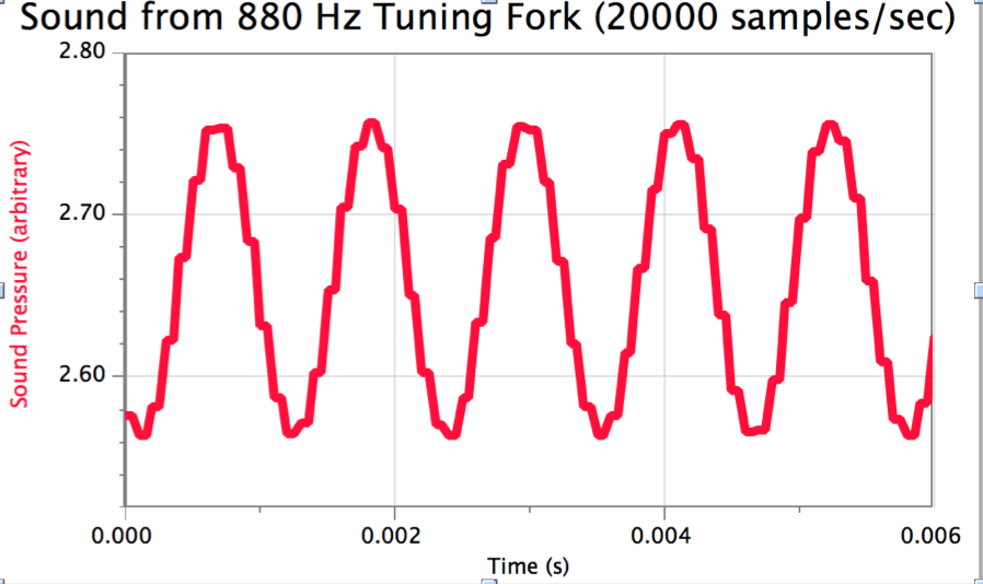
Will increasing the sampling rate improve the results? Surprisingly, if the sampling rate is increased, every data point is doubled, producing a graph that appears to have steps in it. Below is the graph of the sound wave produced by the same tuning fork, but with the data collection rate set to 20000 samples/second. According to the data table in Logger Pro, pairs of identical pressure values occur 0.00005 seconds apart.
How can students measure these sound waves and get results that more accurately reflect the nature of the sound wave?
Tip #1: Do not use a sampling rate higher than 10000. Keeping the sampling rate at 10,000 prevents the strange doubling of data points, which is the cause of the steps in the graph.
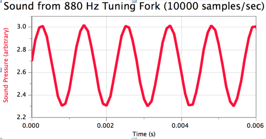
Tip #2: Remove the lines connecting the data points; fit a sine curve to the data. Thanks to Vernier support for this suggestion!
The steps to accomplish this are:
1. Removing the connecting lines: Select the graph, then go to the Graph menu, and select Graph Options. Choose the Graph Options tab, and then de-select “Connect Points,” and click OK. The result at this point should look something like this:
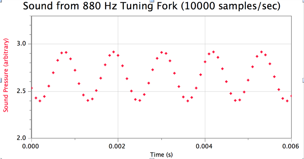
Note: Initially, when you remove the connecting lines, the graph may appear to be a chaotic jumble of data points with no apparent pattern, but by changing the time-axis to a short enough time interval, you will once again be able to see the sine-wave shape of the individual data points.
2. Fitting a sine curve to the data: Click on the “curve fit” button, and select the Sine function. Click “Try Fit” and “OK.” The graph should now look like this: